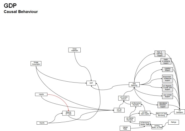
See below for the colourful version of my first stab a causal diagram for an economy (notionally UK), a slice of which you see as the site “header”.
Sequence:
1) Start from a core position, in this case the parameter GDP (generalised), and link to other parameters with arrows that represent some causal influence (real or assumed at this stage). Arrows are one way and notionally represent functions, that can be characterised later. You may also find later that you need to insert intermediate steps between these parameters, as the causal link is not ‘direct’.
2) Here I’ve revised some of the government parameters on the right, based on the budget report late 2010.
3) Now expanded into general influences on investment and trade behaviour on the left hand side.
4) Here’s an example of a potential causal loop linking economic indicators to governement behaviour.
5) Here’s and example of a causal loop for trade and GDP
6) Now add some detail – in this case concentrating on adding links to the behaviour of goods and services production, with some mention of efficiency (and effectiveness).
OK. This provides a first stab at picturing a system, in this case the UK economy, based on basic knowledge and supposition. Like any map, you can delve deeper (to a larger scale) and expand with the same process and/or start to qualify your assumptions (background research). The aim here is to provided an understanding that things are interlinked, some directly, some less so,that we do not operate independently from the system and importantly that there are loops of causation i.e. not just cause then effect, but cause, effect, further effects that come back to change the cause, and so on. The very nature of closed systems.
I’ve mentioned energy in the top left, to indicate an area for expansion into the natrual systems, that support and are affected by the economic activity. Arguably it is sufficient to stop expanding at the edge of the world. We can also (and probably should) expand into wider social systems and impacts, by their nature “softer”, and more “dangerous” to try and quantify, but as important (if not more) as economic outcomes.


Were you on drugs when you did that psychodelic one!
Ibruprofen & boredom !